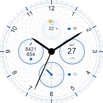
A luxury chronograph watch face has to do two jobs at once. It should feel rich enough to reward a closer look, while remaining calm and readable when you only have a second to check the time. The best designs make that balance look effortless.
Start with glanceable hierarchy
Time is the primary information, so the hour and minute hands must win the visual hierarchy. Subdials, date windows, complications, and decorative markings should support that first reading rather than compete with it.
On a smartwatch, this matters even more because the display is small and the viewing angle changes throughout the day. Strong contrast around the hands and restrained detail near the centre make the face easier to read in motion.
Treat the subdials as a system
Chronograph subdials create the character of the face, but they also create visual weight. Consistent spacing, scale, typography, and hand styles help the subdials feel like one system.
- Use matching line weights across the subdials.
- Keep labels short and legible.
- Preserve enough negative space between the main hands and the subdial content.
- Avoid adding a complication simply because space is available.
Choose colour with the display in mind
A premium palette is not necessarily a muted palette. Deep blue, racing green, warm red, and near-black can all feel refined when the accent colour is used deliberately. The key is to protect contrast for the time and essential complications.
OLED displays also reward darker backgrounds. They can reduce power use and give metallic accents, luminous markers, and small highlights more presence. A good dark face should still separate its layers instead of collapsing into a flat black circle.
Look for useful customisation
Customisation is most valuable when it adapts the face to a real routine. Colour variants, configurable complications, and alternative information layouts can make one design work for travel, fitness, work, or a quiet evening.
A luxury chronograph watch face should remain coherent after customisation. If every element can change independently, the design can quickly lose the relationships that made it feel polished in the first place.
Check the always-on display
The always-on state is part of the product, not an afterthought. It should preserve the identity of the watch face while reducing brightness and visual complexity. Important time markers need to survive, and decorative elements should step back.
The final test is everyday use
A watch face can look impressive in a promotional image and still become tiring after a week. The best test is simple: can you read it quickly, does it fit your routine, and do the details continue to feel intentional rather than noisy?
Luxury Chronograph by Jenius Apps is designed around that balance, combining several colour directions with a clear analogue hierarchy and chronograph-inspired detail.